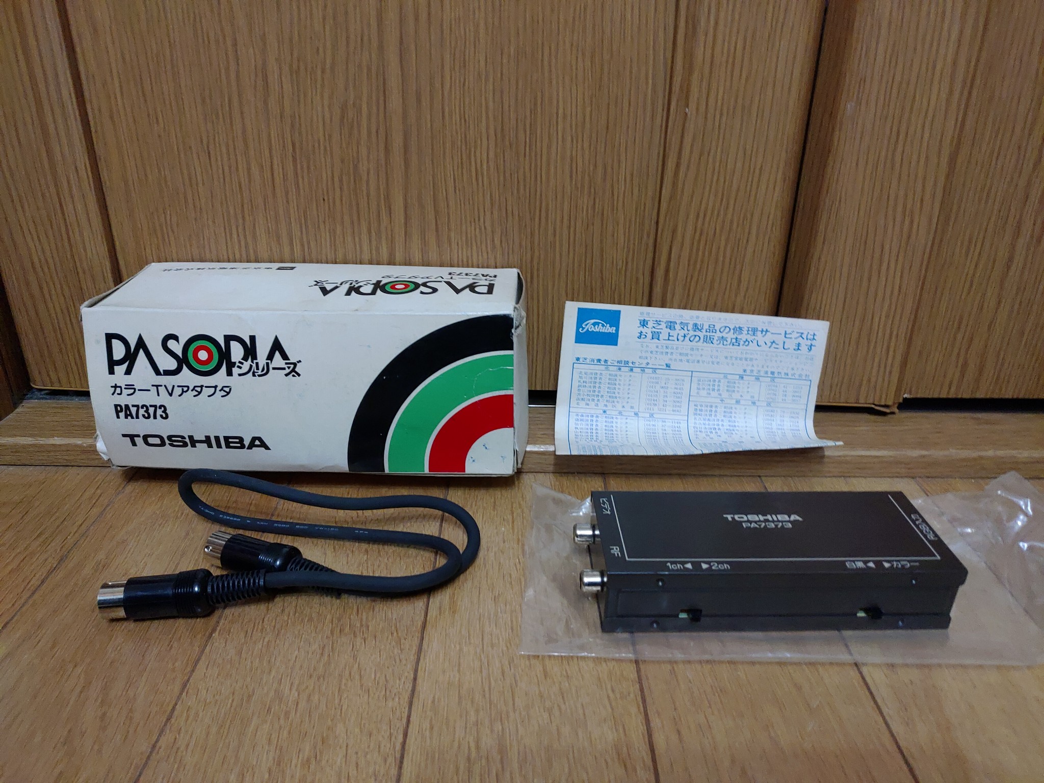
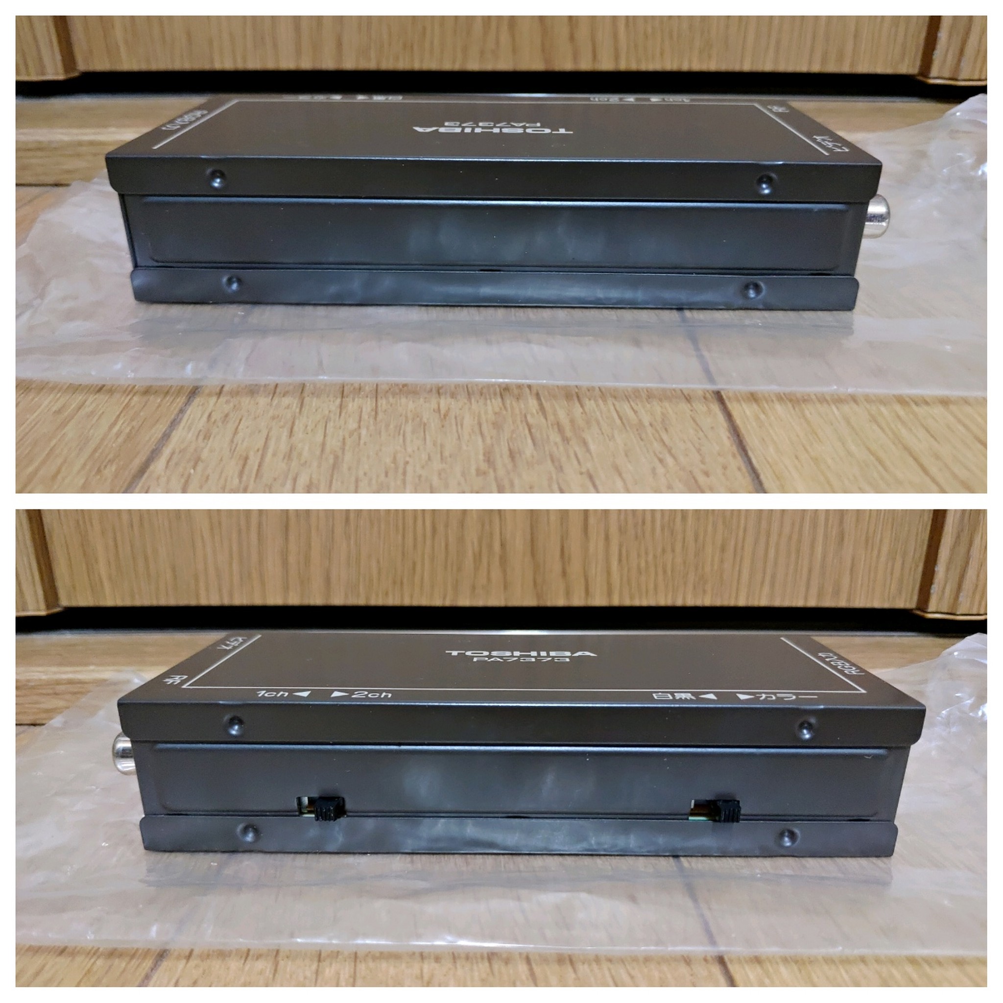
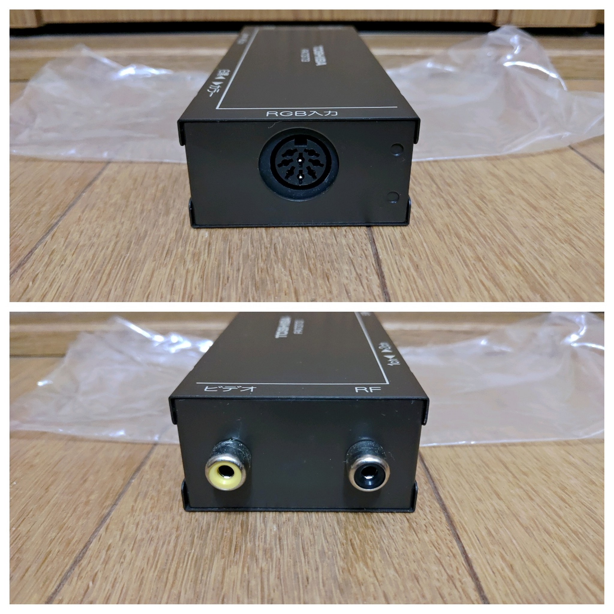
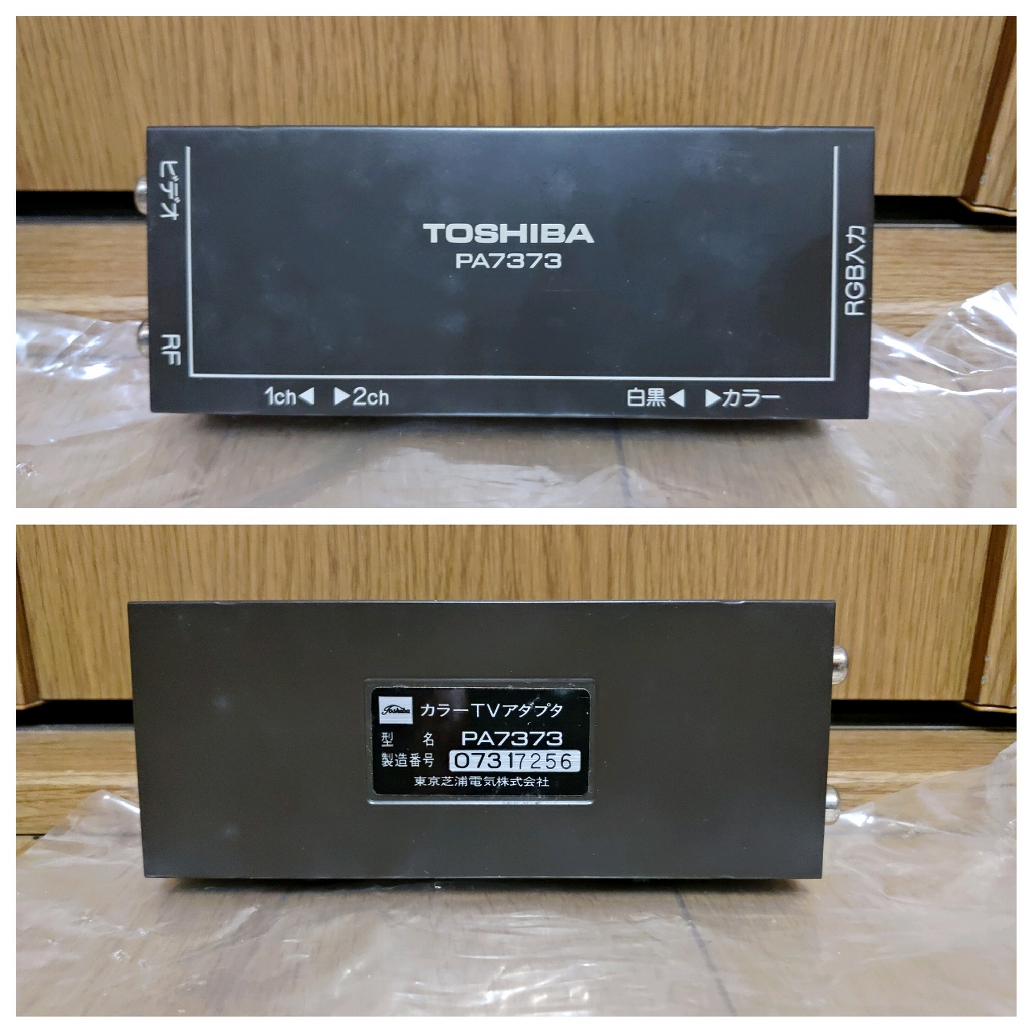
I’ve picked up a few Pasopia7s recently and two of them included this item. It converts digital RGB to RF or composite video signal. This isn’t the only one; I have one from Hitachi but it’s positively huge and requires a separate power adapter, which I don’t have. I also have one for the PC-6001mkIISR, which I will do a write-up of later, because that serves a special purpose.
This one, though, just converts the signal. It’s compact and receives power directly from the digital RGB port. I was thinking something like this might be handy for my vintage computer meetup if it works well and can be used on some other systems.
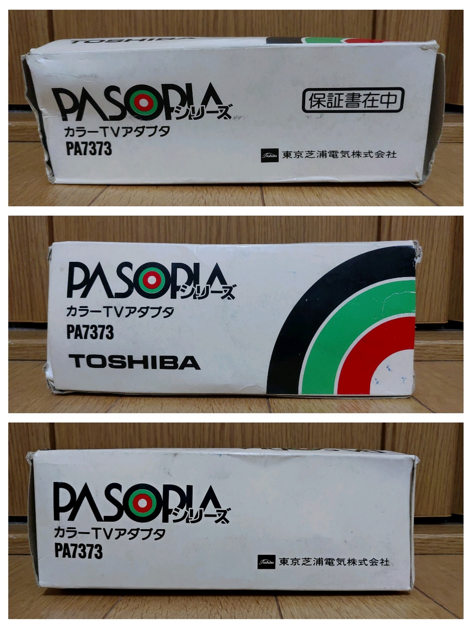
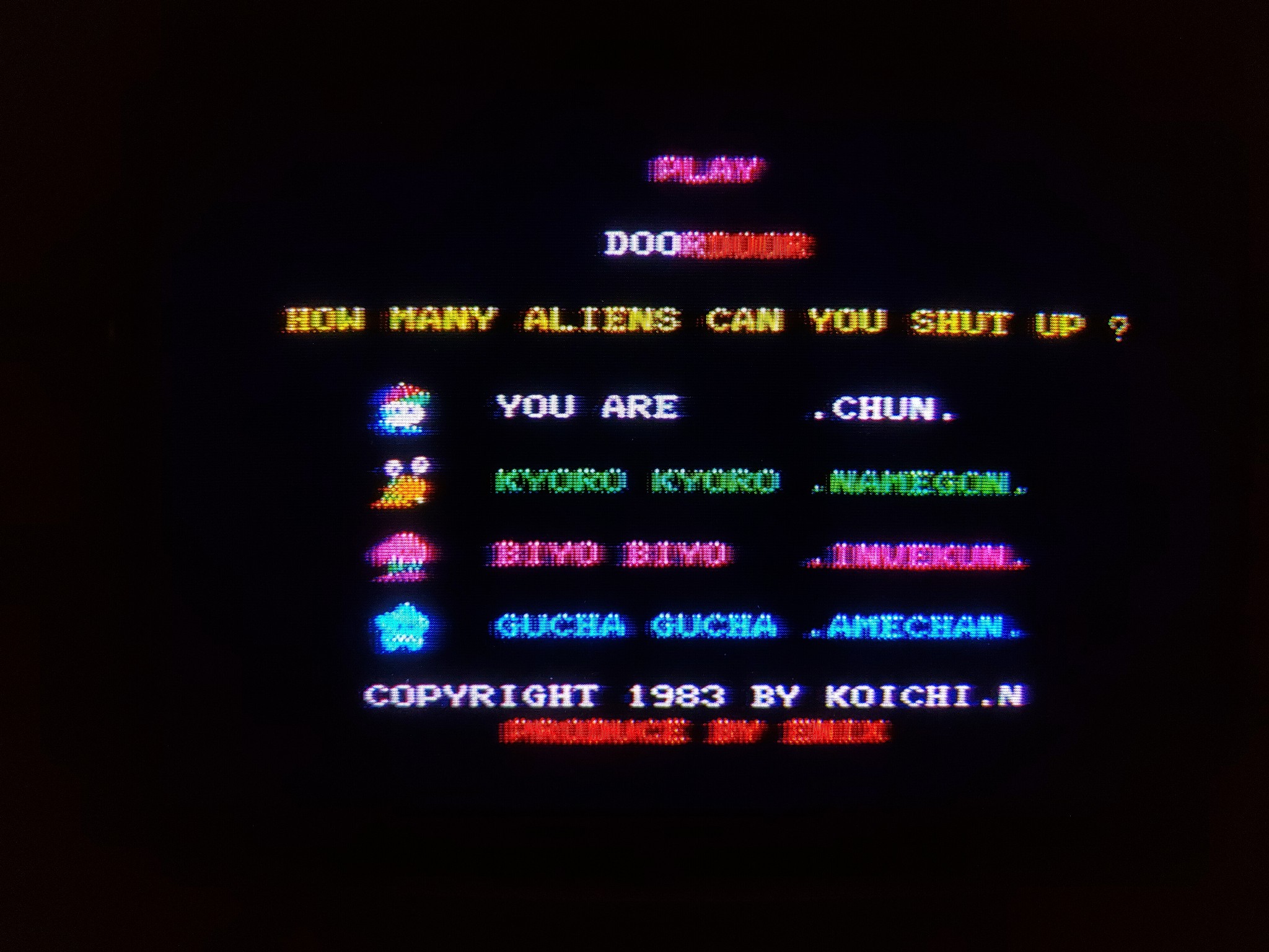
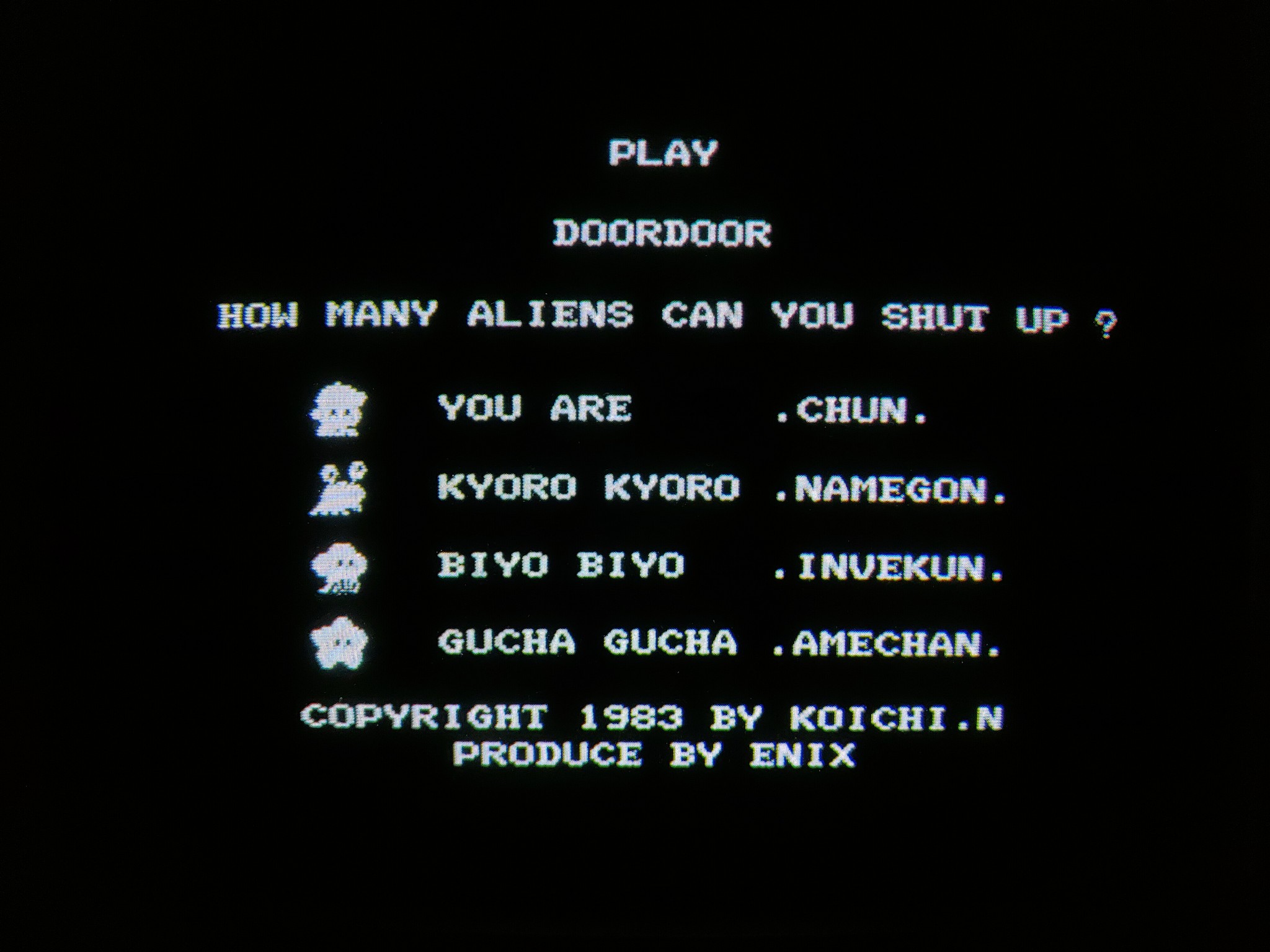
So obviously the composite output won’t be as good as the digital RGB is, but how usable is it? I took comparison pictures of all three modes: digital RGB, converted composite, and the Pasopia7’s on-board monochrome composite output.
First thing that surprised me was that the monochrome output is literally only black or white. I am pretty sure my other computers with monochrome output – including the Pasopia first-gen, would produce greyscale.
I tested them all on my NEC PC-TV455. Here is 40-column text mode.
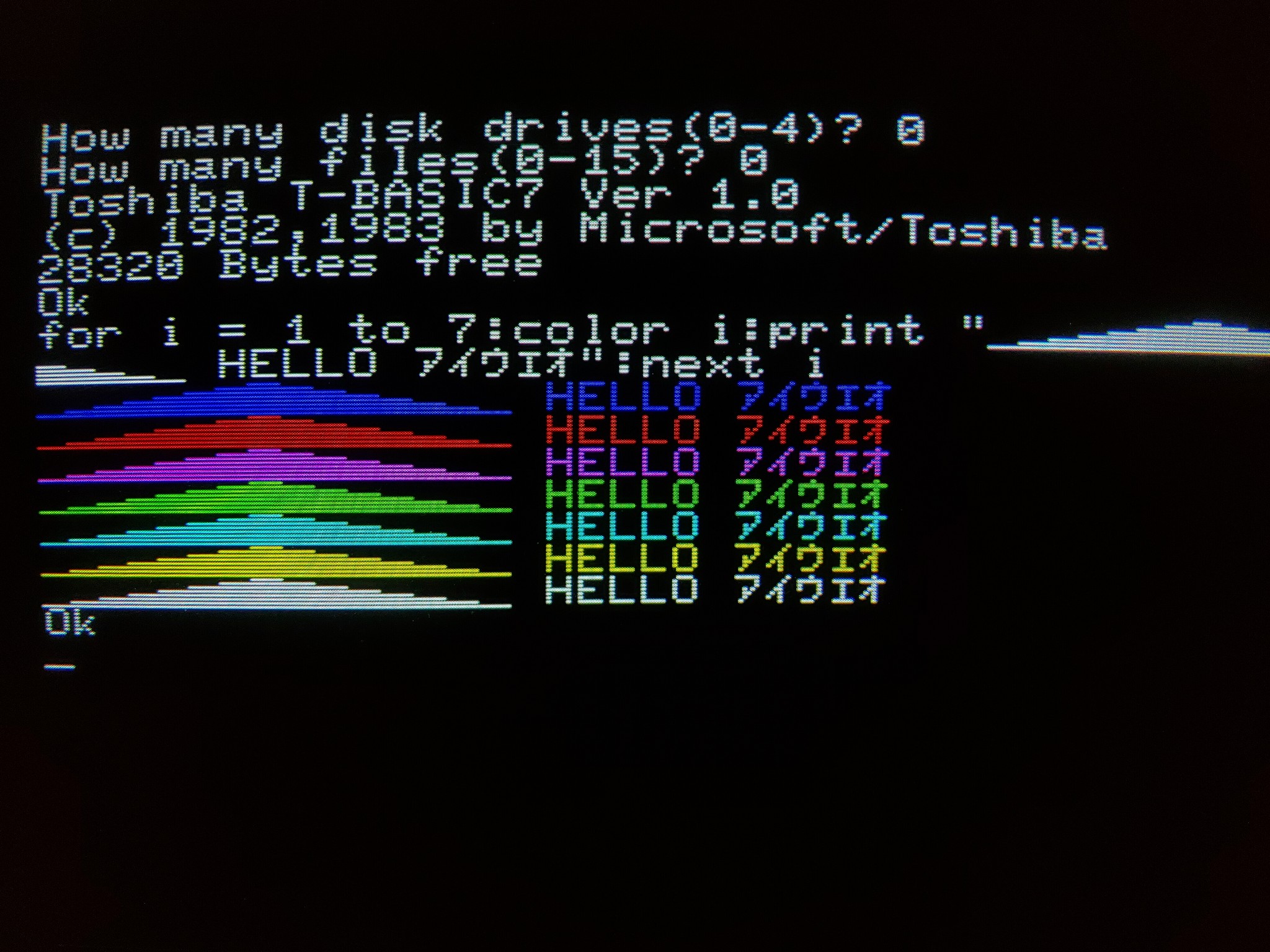
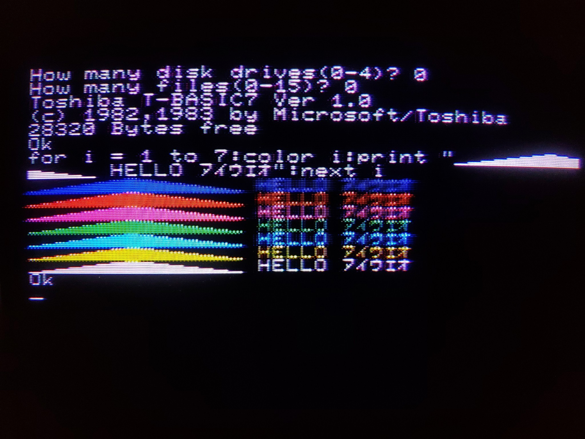
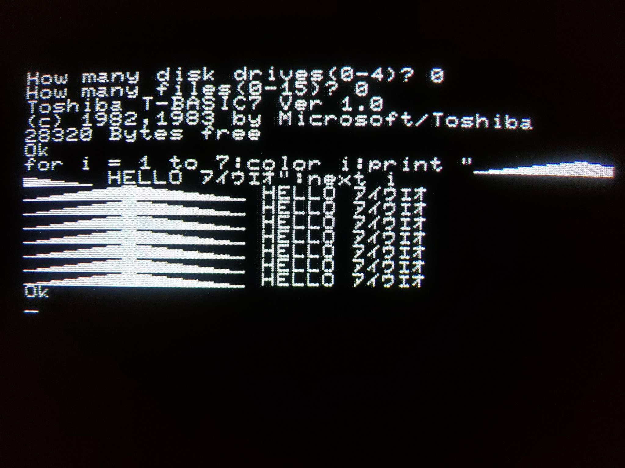
So obviously the digital RGB is crisper and the composite output suffers from color bleed. But it’s not so bad. Some color combinations are better than others; essentially the greater the contrast, the greater the readability. White and yellow are pretty good, with cyan and green pushing the borderline of unacceptability, while purple (actually seems to come out more pink than purple, but there may be adjustments possible to get a closer replication), red, and blue are pretty awful. But if you change the background color to white, I bet blue, red, and purple would look fine. If I were going to read a lot of text, I’d prefer the monochrome composite to the color composite, though.
Next is 80-column text mode, and the differences become more pronounced, the composite is pretty unpleasant to try and read through. Again, the monochrome composite would be the way to go.
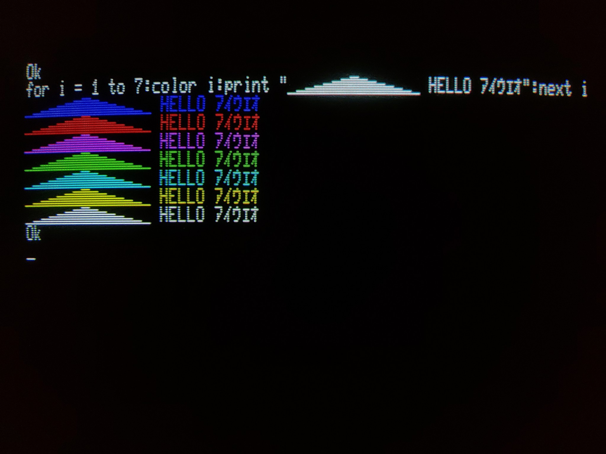
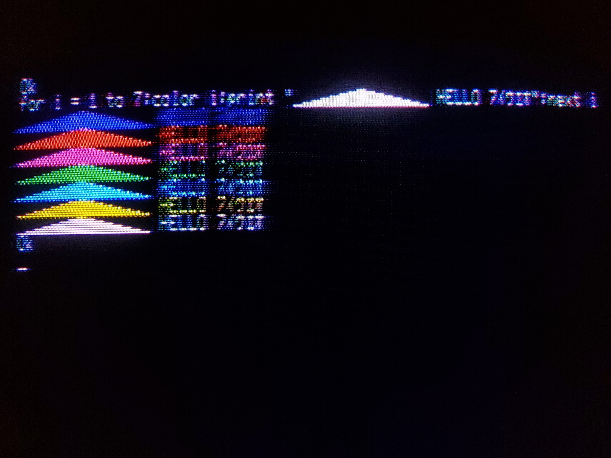
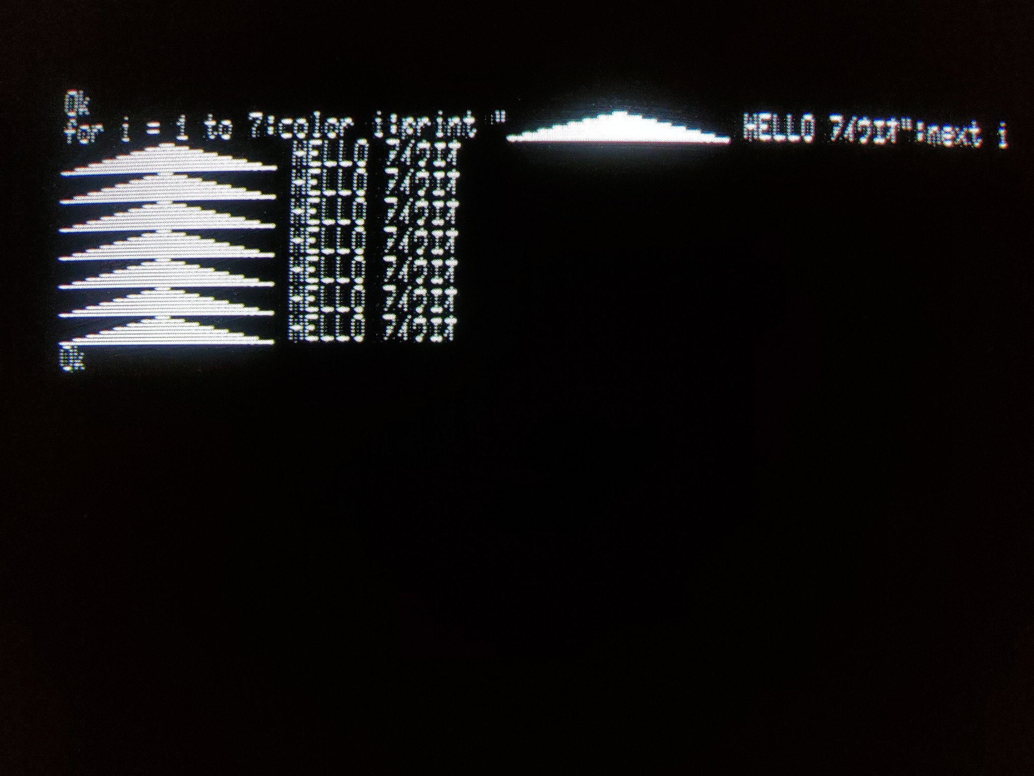
And finally, graphics mode. As the graphics mode doesn’t depend as much on text and you’re looking more at shapes, the composite, while still not as nice as the digital RGB, is still plenty playable.
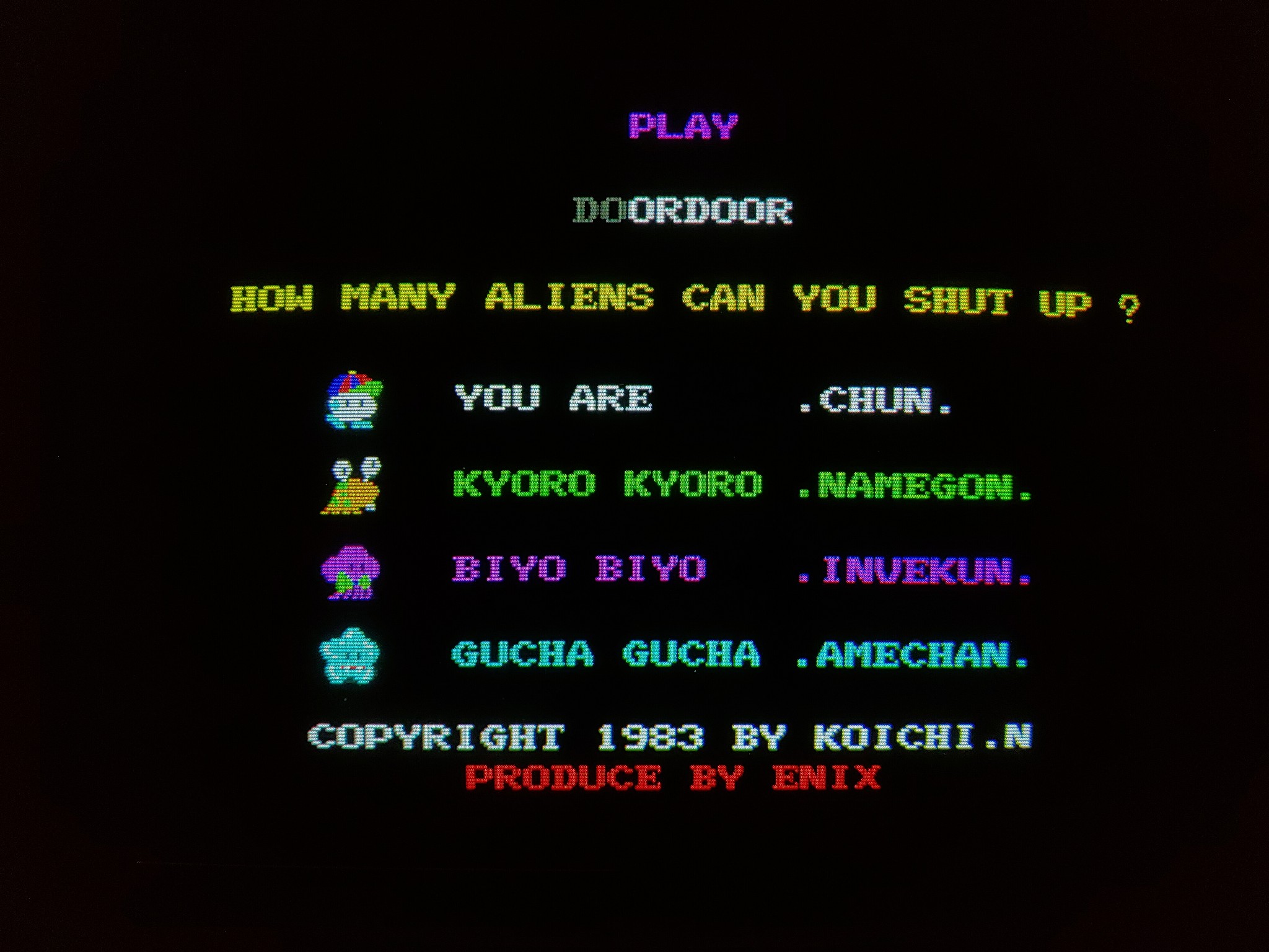
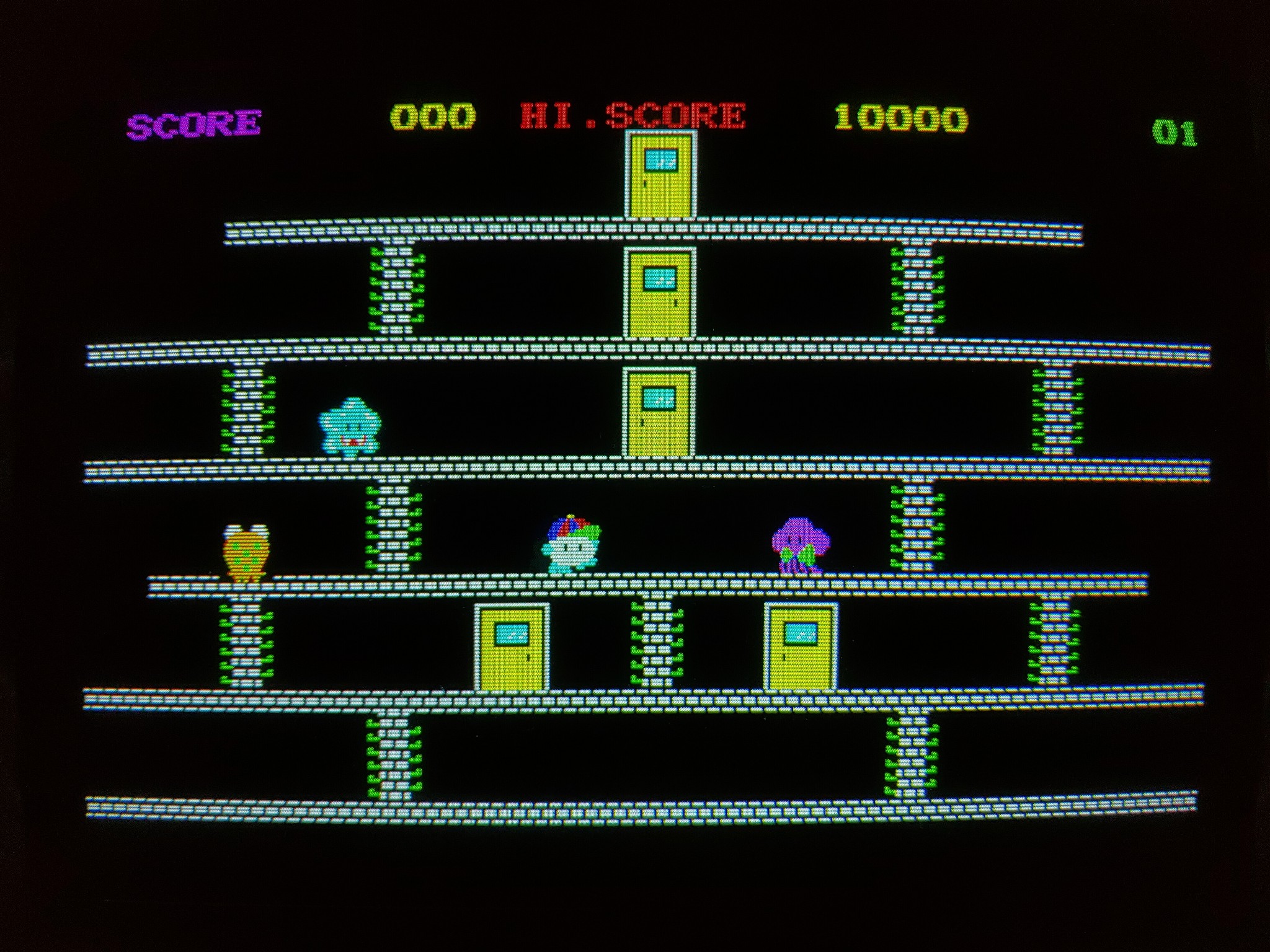
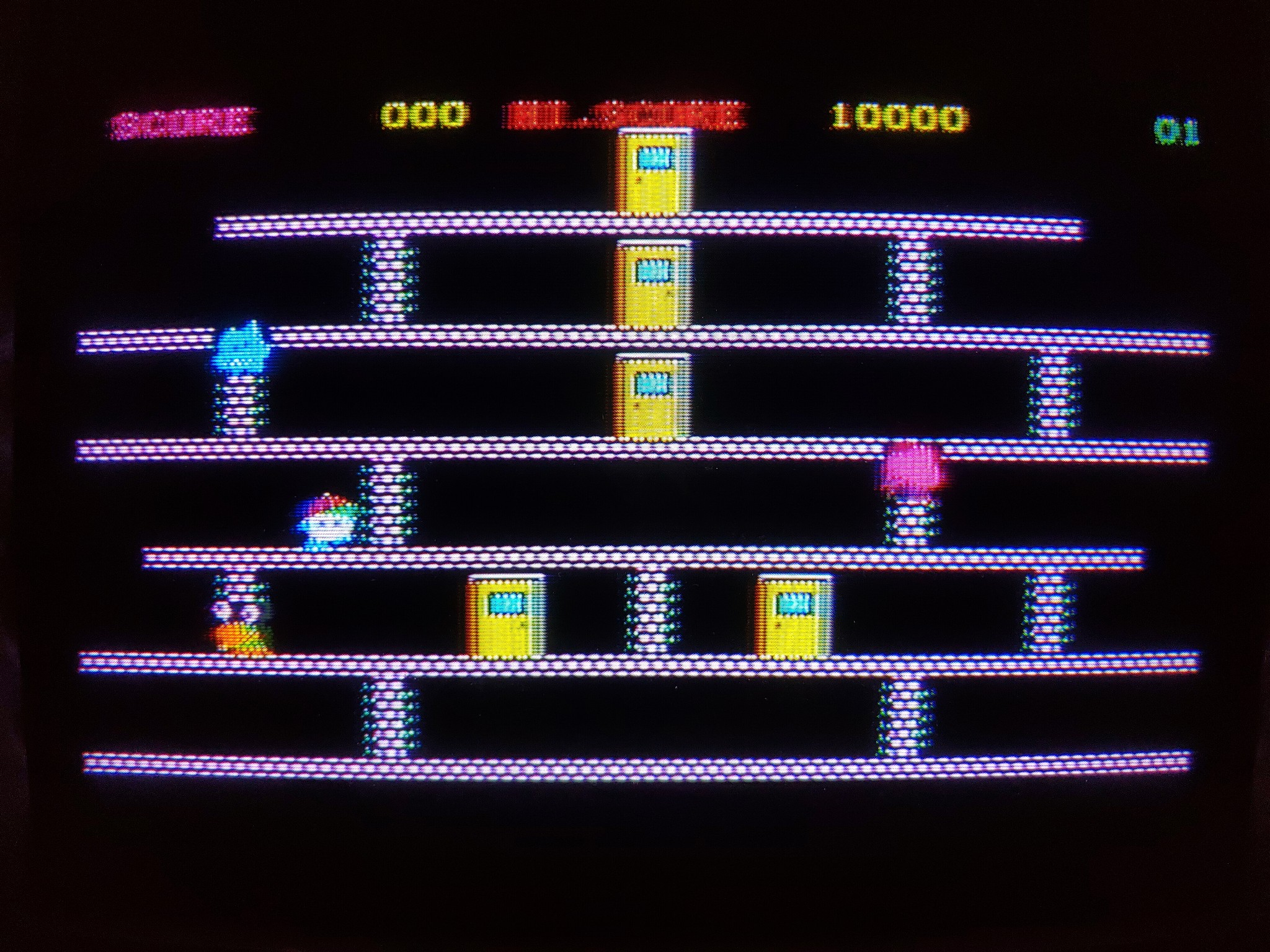

But this, too, I think depends a lot on color combinations. As the game is on a black background, they contrast well with the bright colors of the characters.