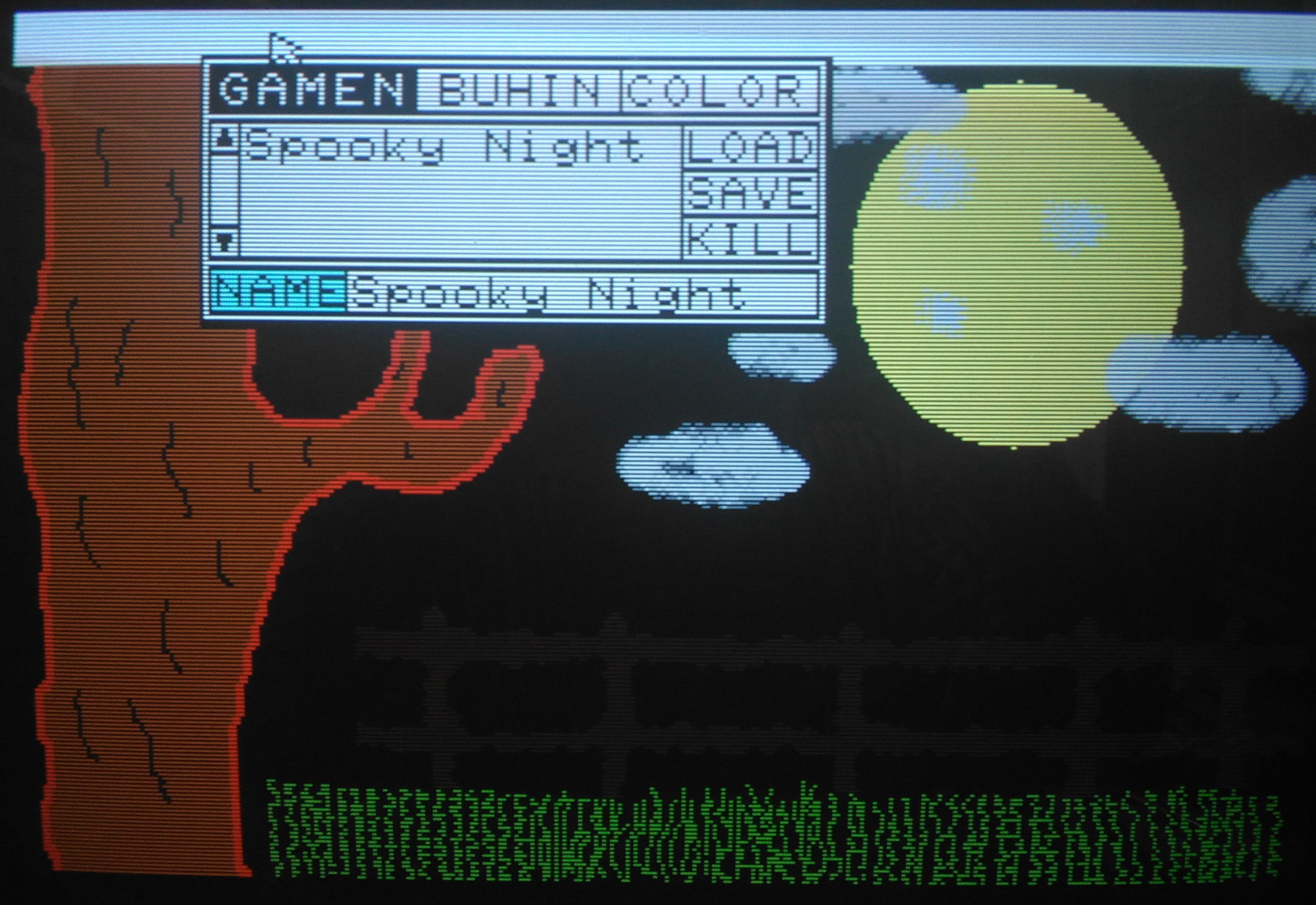
I finally got around to firing up my X1’s included “Graphics Tool”, part of the included “Z’s Staff-Z” software bundle that came with my system. I am no artist by any stretch and I figured loading up and attempting to use an 8-bit paint program would be an excruciating exercise. But I wanted to explore more about my Sharp X1 Turbo Z. There were definitely moments of frustration, but it was also a great experience.
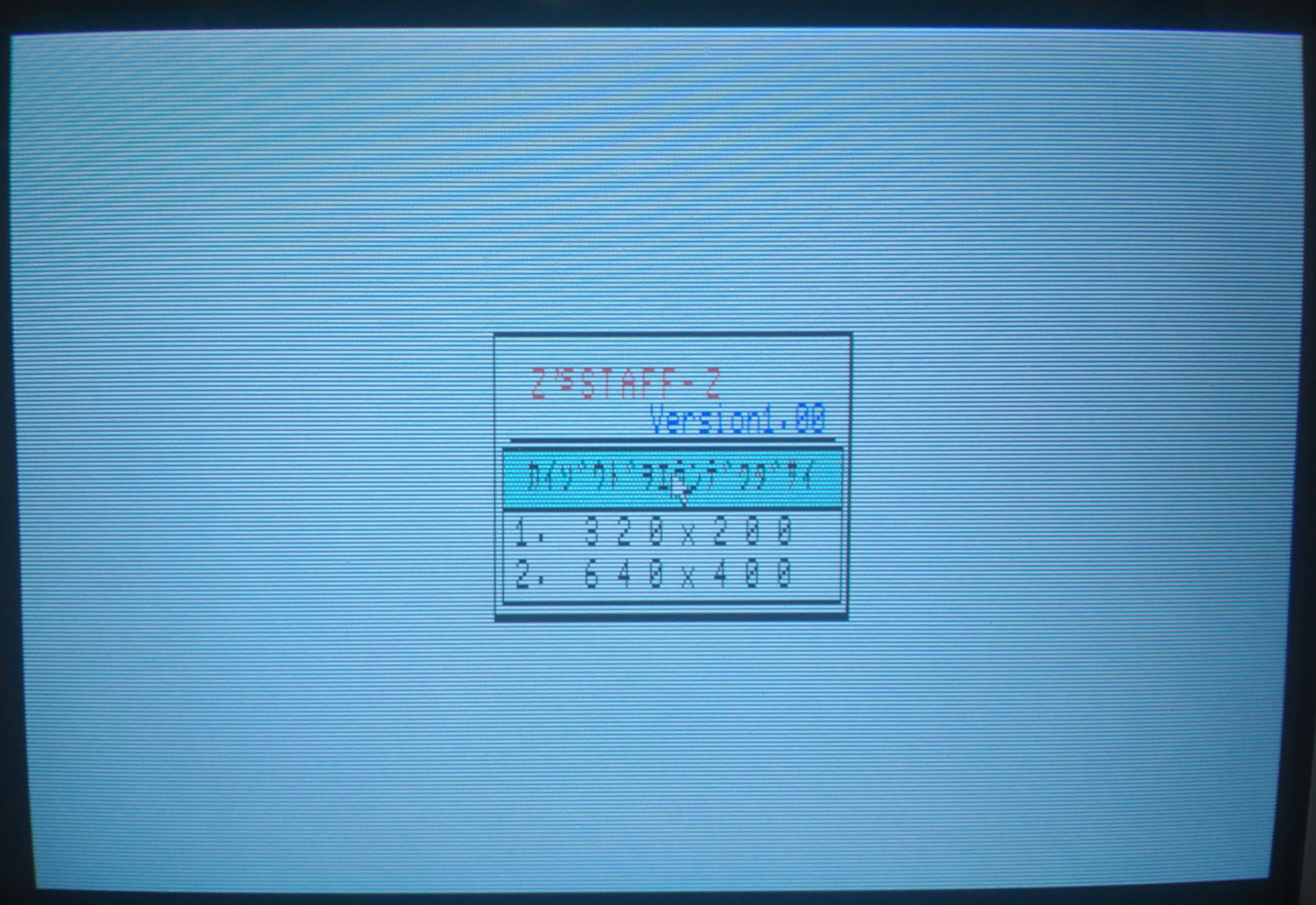
The opening screen launches you into low-res mode where you have two choices for video resolution – 320×200 or 640×400. Images made in one resolution cannot be opened in the other. I went with 320×200 for starters.
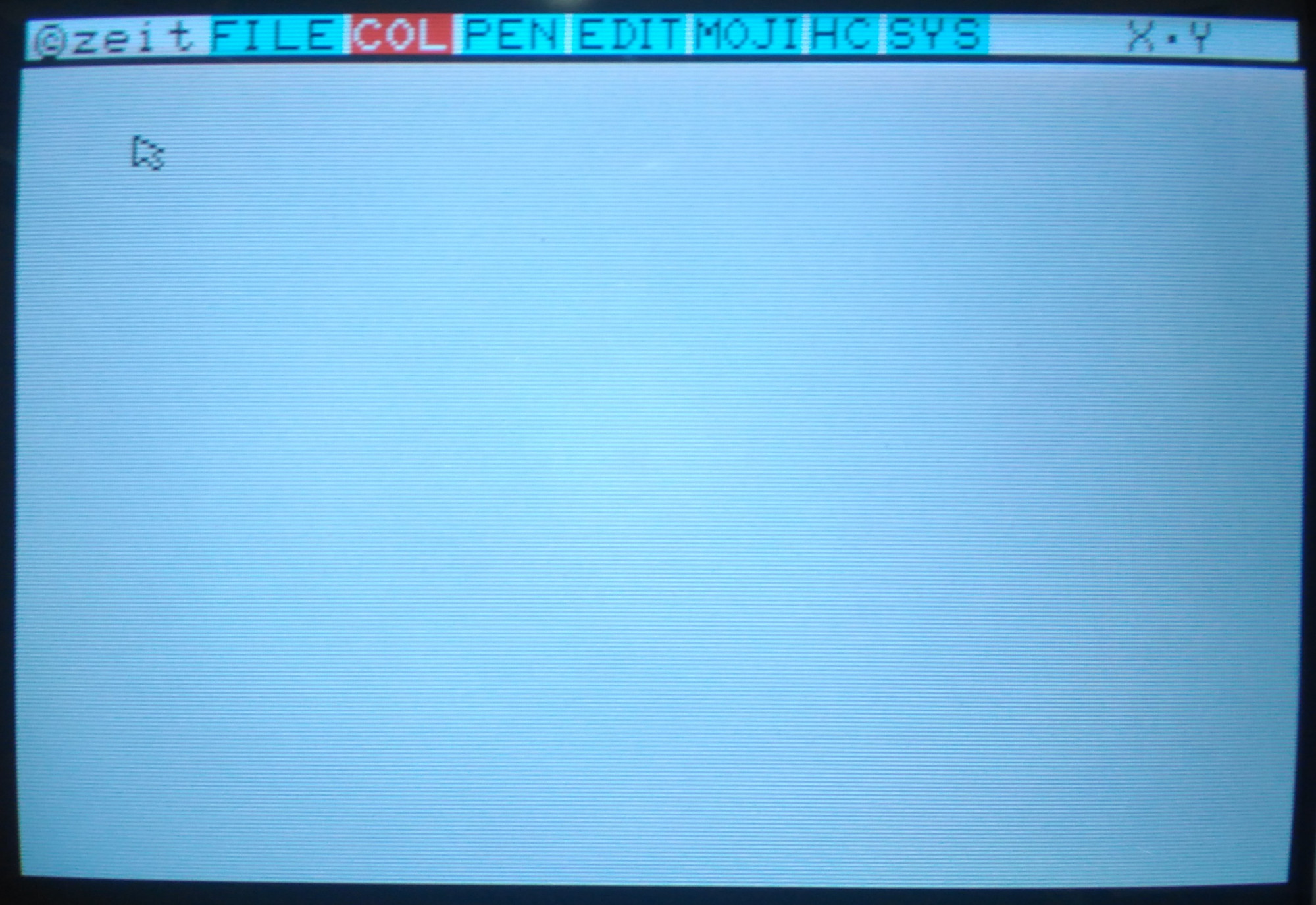
The interface appears minimal, with a single row of menu options at the top. The entire screen is your canvas.
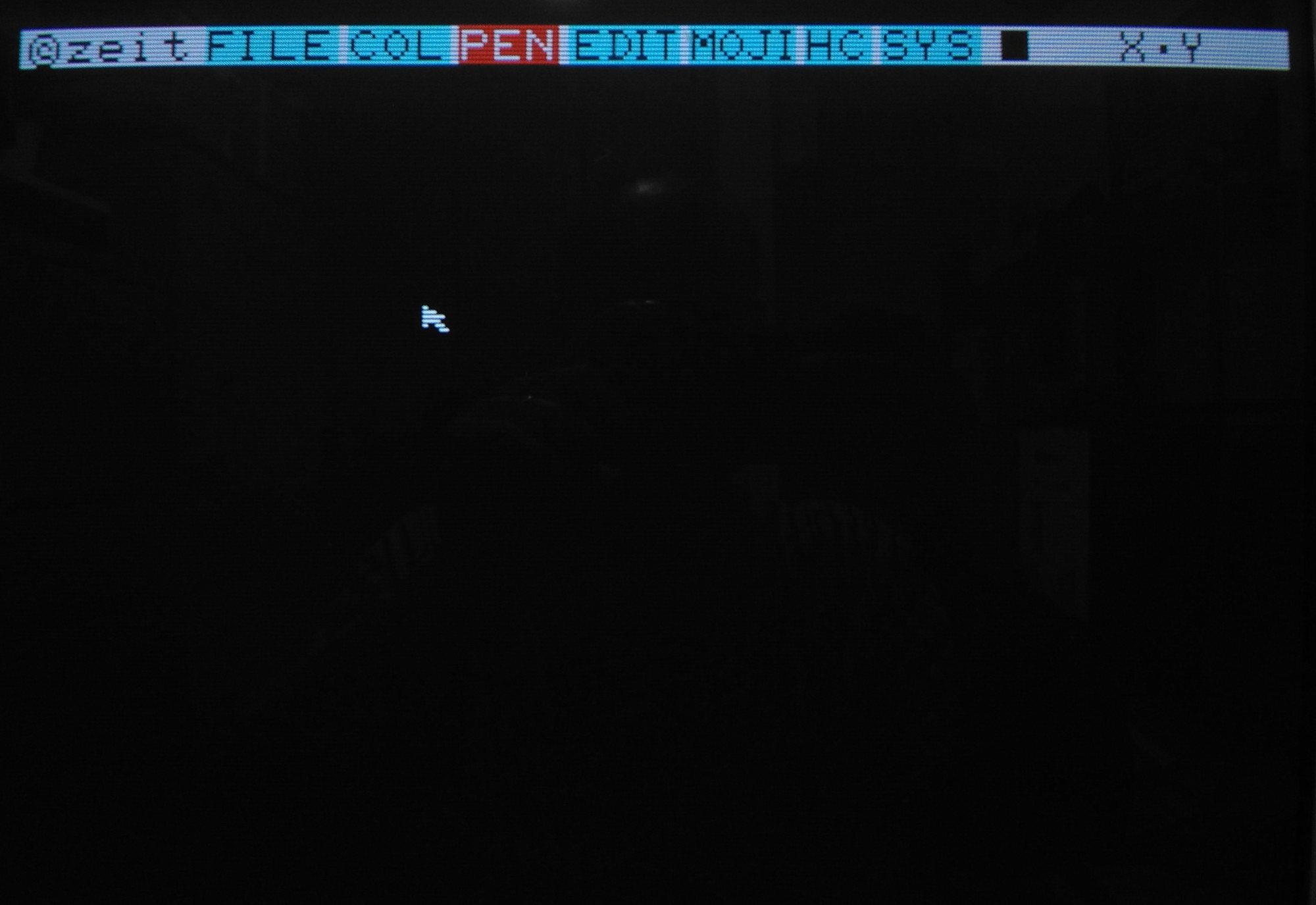
If you look at the final picture, most people would probably imagine that the background was filled first first, but that’s for people who have a plan, and that does not include me! Nonetheless, to make it look like a progression of the picture creation process, I went back and took a screenshot of a black screen.
Here’s what actually happened first: I’m not particularly creative in this kind of environment, but I grabbed the mouse and started free-drawing a curvy line. I thought perhaps it could become a tree, so I went with that. When I finished the base structure of the tree, I mixed a custom brown color and filled the tree, then I thought the tree didn’t look quite normal, but perhaps I could give it some legitimacy by making it a creepy environment, so it became a nighttime sky.
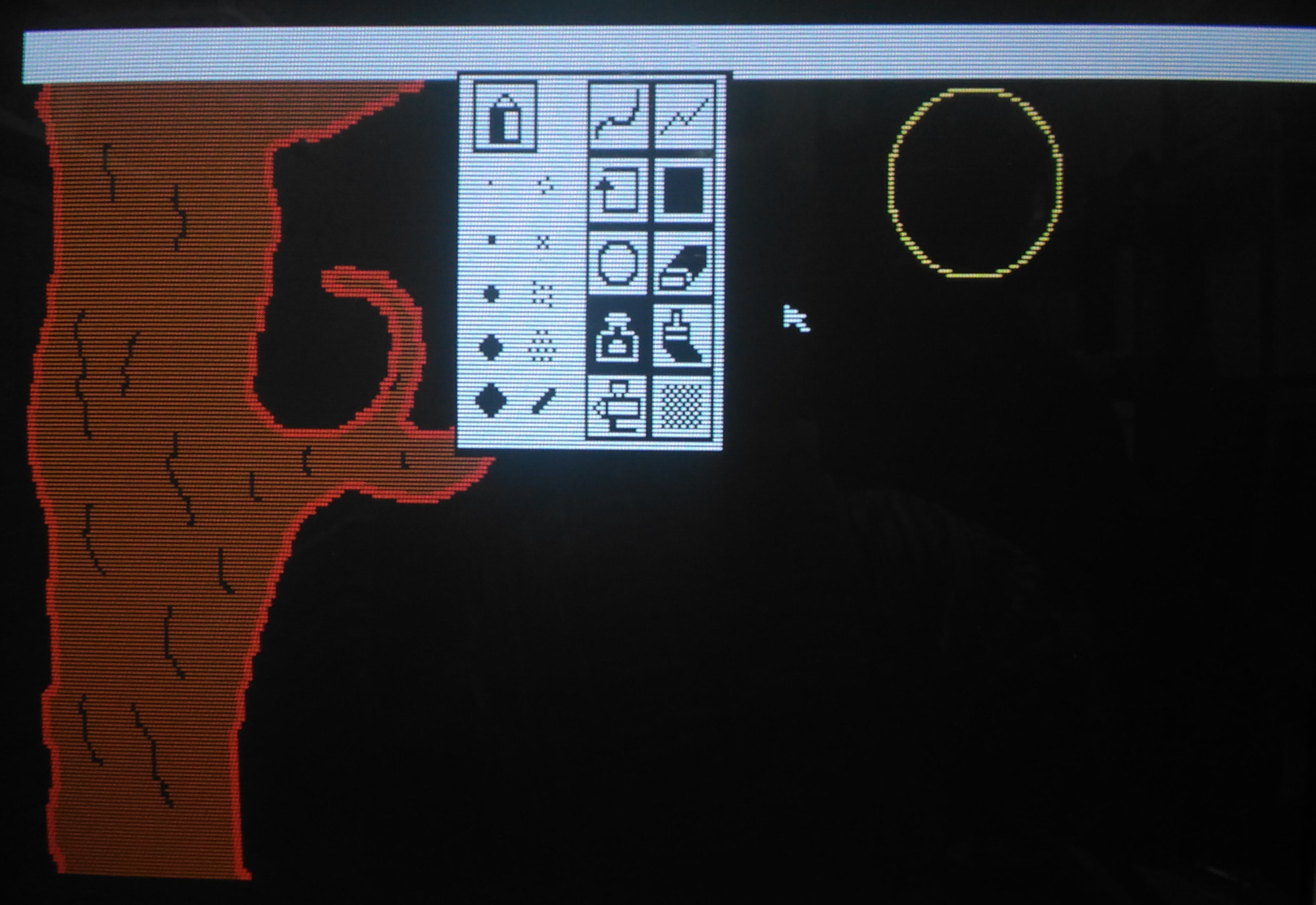
Next I finished the moon with just a simple circle and added some “craters”, which sounded good at the time but actually probably made it worse. Added some grass by drawing sloppy lines with the freehand tool. But the part I like best is the clouds. I struggled with those clouds, trying this and that with different pen sizes, different shades of gray, different diffusion tools, nothing I tried didn’t look like garbage. I actually gave up on the clouds for a while, but there is no screenshot of that stage, so here’s another fast-forward screenshot:

Having given up on the clouds, I thought I’d make a wooden fence. I thought I saw a tool that would be good for that, but once I started drawing the fence with it, I quickly learned that this was, in fact, the tool for drawing clouds. The fence was ultimately made by a series of thin, dark brown lines (so dark it barely shows up in my photograph, but believe me, they’re there!), and then going back to the freehand tool with black to give the fence a more unkempt appearance.

And that’s about enough for the picture. Hokusai, I am not. But the program left a good impression on me. As much as I thought that this antiquated program would be tedious for me to get anything done with, I was pleasantly surprised. For a 128KB computer, they crammed in a lot of features and made it a nice tool to explore and even an amateur can have a little fun with it.
The edit page was surprisingly powerful compared to my impression of the icons. I assumed it was just simple things like flip or rotate the entire image, but actually you make a selection of what you want flipped or rotated. You can also copy and paste (which I wish I’d known before I did the grass). It also has a “grow selection” function that does a decent job of stretching out elements of your image.

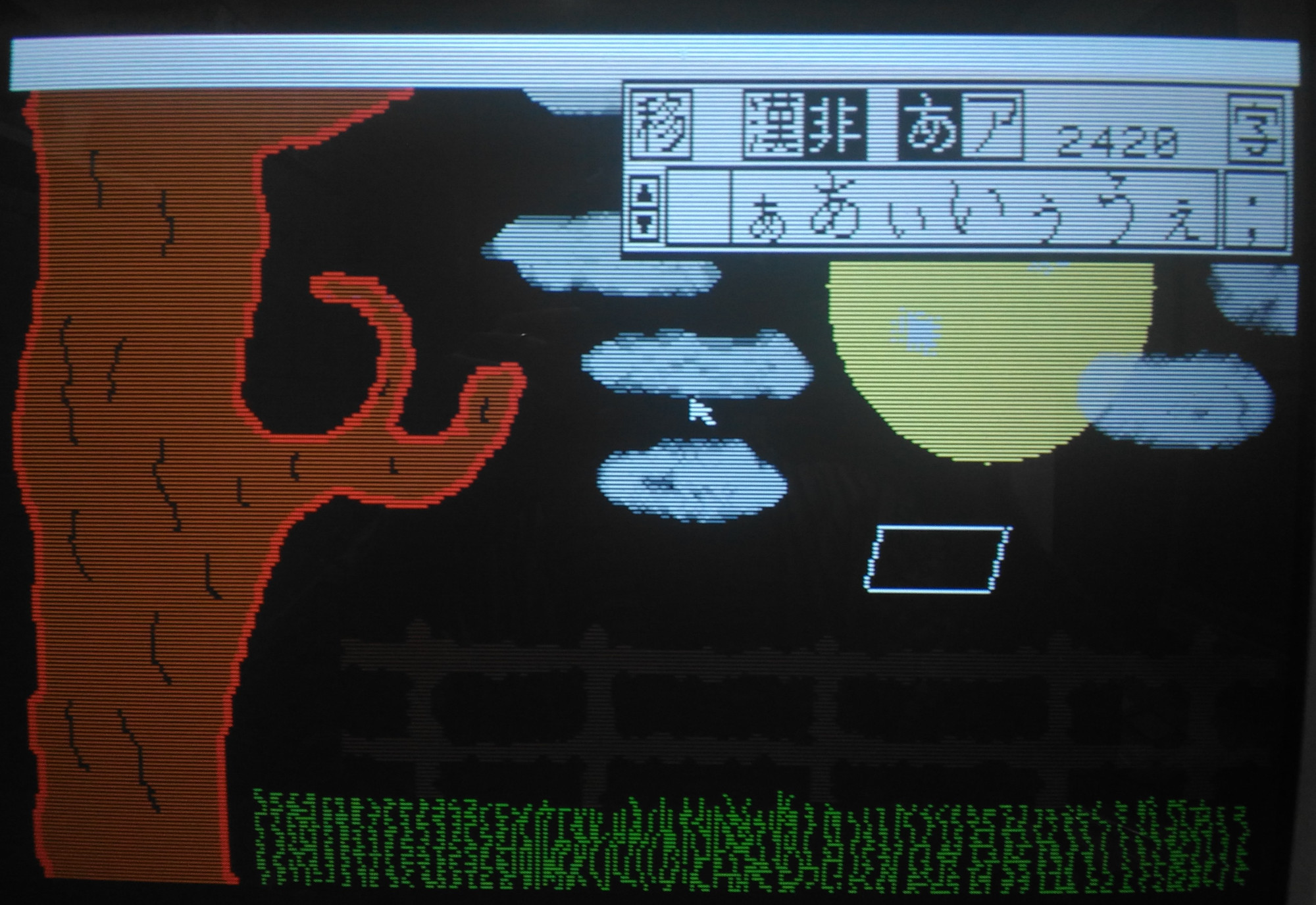
The text input took some time to figure out. You can only add one character at a time, and it appears to be fixed spacing. But there are some cool effects available, too. You can use or turn off any of the three features – characters, outline, and shadowing. Outline and shadow are basic but the unusual thing to me is being able to turn off the characters, so you can just have the outline and/or shadow. You can also set double width, double height, and italics for the characters.
The only part that I find really frustrating is that it has no concept of “undo”. But I think there just isn’t enough memory for it to remember what pixels were changed and what their original colors were. So “undoing” is actually “cover up with an appropriate color” or “restore from last save.”
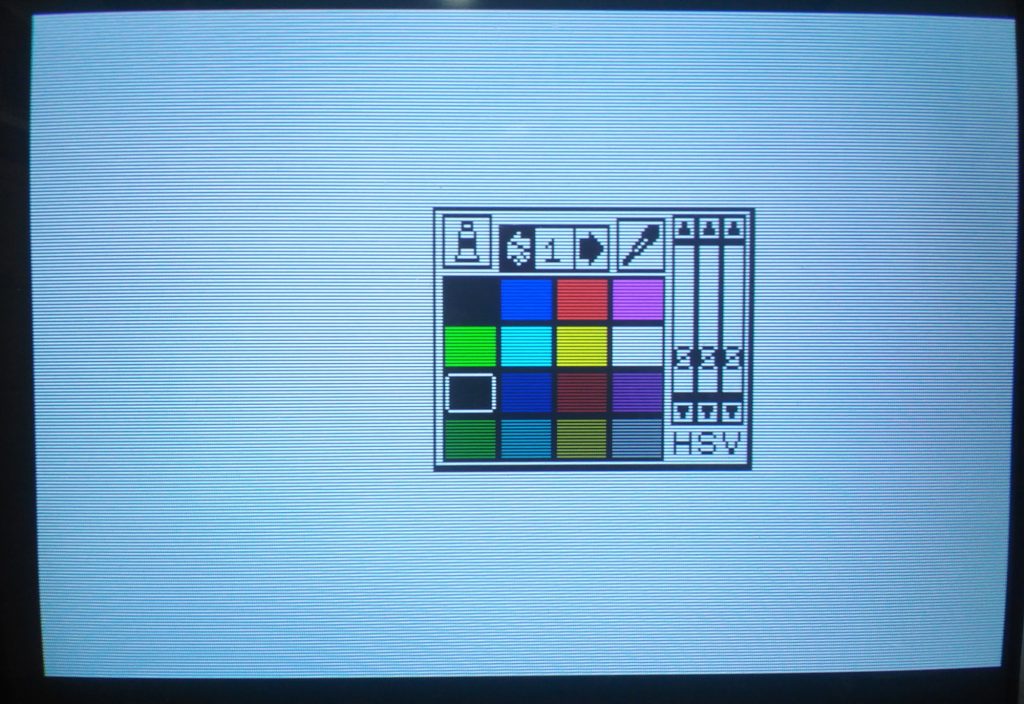
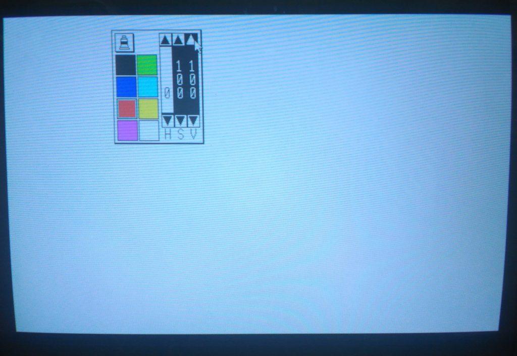
So getting back to the resolution choices at the launch of the program, the reason I went with 320×200 is because it allows access to the computer’s generous 4096-color (12-bit) color palette. Thanks to a hefty 96KB of video RAM, each pixel can have its own color. Obviously I didn’t take advantage of that, but I could have!
The software offers you five pages of 16 quick-select colors, but you can alter the colors anytime with the HSV (hue/saturation/value) sliders, and changing a color does not affect pixels already drawn on the canvas using the previous color.
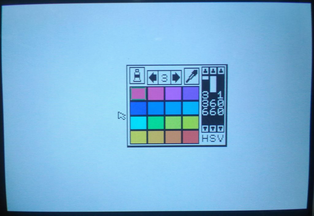
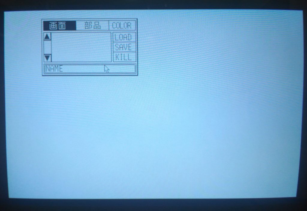
640×400 is four times the resolution, so is limited to 8 colors (3-bit color). Some of the interface elements are replaced with kanji so it looks a little different. And as you can see, it looks a lot cleaner. And of course, all the extra real estate that 4x resolution provides is nice. But you’re giving up 4088 colors!
For those curious but maybe don’t know how to calculate it, I checked the numbers and it is indeed necessary to drop down to 8 colors to achieve 640×400. Look:
320×200 = 64000 pixels, 4096 colors = 212 (12 bits = 1.5 bytes)
64000 * 1.5 = 96000
640×400 = 256,000 pixels, 8 colors = 23 (3 bits = .375 bytes)
256000*.375 = 96000
As the computer has 96KB of video RAM, these are the limits at these resolutions.